
This page is for internal use only.
In this page, I will describe some very basic things about webpage building. Some can be directly used as the template. but everything in this page is no more than the generalized information and should be customized as necessary. Please read the following information using Gempages app and see the settings of each elements mentioned. If you see this page on a browser, you won't be able to fully understand what I'm talking about. - Hiro
1. Use Columns
This is the first step of making uniformed, neat webpage. You can place any elements directly into the page. But, in most cases, I don't recommend to do that. This title (1, use Columns) and the body text are the example already. As you can see, The left side edge of the title and body text are aligned because 2 text elements (title and body text) are in the same Column element. if you don't use the Column, the text will be
like this.
The use of Column element gives many benefits. What I have described is, 'Column works as the container and all elements in one column are affected by the same column settings.' In this case, Column width affects both title text and body text.
1-1 Use persentages = Best for 'Responsive' layout in many cases
I'm not spending time to define what 'Responsive layout' is. Good descriptions can easily be found online (Hit 'Responsive layout' on Youtube). Am showing the concrete examples of Responsive layouts with Column elements. By default, Gempages Column element is set as 'Fixed width at 1200px wide'. But, unless you have any specific aim or reason, best not to use 'fixed' as 'responsive' webpage changes its layout depending on the screen type, ratio and width.
FIXED at 500px
Here is the comparison of text with fixed width and full width.
THIS IS FIXED width, 500px.
While typing, I added line breaks so that the text looks good
on my screen.
How does this text look like? looks good? neat? or messy?
Even if you look it's good, let's narrow down the widths of browser window.
You will see that the text becomes so messy
100% of the column
Here is the comparison of text with fixed width and full width.THIS DOESN'T HAVE ANY SPECIFIC COLUMN WIDTH AND SIMPLY SET THE WIDTH AT 100%. No line breaks are used neither.
Instead of using line breaks, adding 1 blank row and separate the text into several paragraphs may be considerable. Now try to narrow down the browser window width. The line breaks (actually text over wraps) will be added automatically as necessary and overall text layout won't become messy at all.
1-2 Full width
In the example above, I set '100%' to the 'child (inner) column' that is placed in the 'parent (outer)' column. In that case, '100%' means just the full width of the parent column (Shown as the red box). But, what happens if you set the parent column's width at 100%? As you can see, the Column width becomes the full width of the page itself. Shown as yellow box.
1-3 Add appropriate margins (hasn't added yet)
It totally depends on the types of contents though, in many cases, adding margins is the good activity. In this case, The text is too close to the page edge. this may make our website hard to read. If Smartphones, people holds the device with their hand and the contents that are too close to the page edge may be hidden in their finger. And, as you see, 1-2 and 1-3 look like 1 big yellow box. This is not what I meant to do. Lets wix those
1-3 Add appropriate margins (ADDED!!)
I added 30 px margin to the top of the Column. As the result, now there is the gap (looks like holizontal white line) is on top of this yellow box. besides that, I added 20 px margins to text Columns, both right and left. By doing so, now the text has some distance from the edge of the page. You can adjust margins from the left side palette, Design > Spacing
1-4 Use of padding
Instead of adding margins to each elements, i just added '20 px Padding' to all of Top, bottom right and left of Column element. As the result, now the text has yellow spaces around it in all directions.
Please remember: We normally apply '100% of the page width' plus '20 px margin from the edge of the page'.
1-5 What's the difference between Margins and paddings?
In the 1-3 and 1-4, the result itself is almost the same (20 px of spacing to where we want). The Margin and the Padding may look same and in fact they do the same job in some cases. But you need to use both properly depending on the situations. In short, Margin = out side, Padding = inside. here are the examples.
The 4-column element below has no margin and paddings. and its column gap is also set at zero.In short, there is no spacings around each columns EXCEPT left edge and right edge because the element is placed in the parent column, which has 20 px margins on both sides. Each content is too close and you can hardly see the border.
TITLE
TITLE
TITLE
TITLE
TITLE
TITLE
TITLE
TITLE
[PADDINGS]
Added 20 px padding to the right, left, top and bottom of the column. Now each text boxes are separate.
Padding = spacing INSIDE the column
TITLE
TITLE
TITLE
TITLE
TITLE
TITLE
TITLE
TITLE
[MARGINS - hasn't added yet!]
Let's change background color! then each box should look even better!!.....better......oops.
Now it looks like one big box again.
TITLE
TITLE
TITLE
TITLE
TITLE
TITLE
TITLE
TITLE
[MARGINS - Added!]
Added 10 px margin on the top of second 4-column element so that there is the line between top 4 and bottom 4.
Margin = spacing OUTSIDE the column, so no background color in the margin spacings.
GOOD TO KNOW!!
In addition to margin, i put the column gap back to 5px to make vertical lines between each boxes.
...Yes, 5px gap. NOT 10 px.
You can't set margins between columns as they are controlled by Column Gap function.
This is kinda tricky. The margin value is simply the size of spacing.
But Column gap is the gap on the both sides of EACH column.
I mean, if you set column gap at 10 px, then 20 px spacing appears
(10 px from the left column + another 10 px from the right one)
So the combination of:
10px margin (Holizontal)
plus
5px column gap (Vertical, 5+5=10)
are necessary.
TITLE
TITLE
TITLE
TITLE
TITLE
TITLE
TITLE
TITLE
[Still NOT perfect!!]
Now all of 8 boxes are lined up neatly......On the wide screens.
Now narrow down the screen again and you'll see the problem.
(You can do that using the switch buttons on top..choose tablet)
Yes, 2 each boxes stick together!!
To avoid this, make sure to add margins to each children columns, not parent.
I added 10 px to all of 8 1-column elements.
On wide screen, they look the same and even on narrower screen, they are still separate.
TITLE
TITLE
TITLE
TITLE
TITLE
TITLE
TITLE
TITLE
[Sometimes compromise]
The example looks good because the text length is exactly the same.
The real world will be like this↓↓↓↓↓.
In such case, you may have to give up to color the box.
At least I don't have the idea to fix it.
But I have an alternative: See 1-6-4 below.
Still this method works effectively with the images.
But, image needs to have exactly same ratio.
That's why am telling that make everything 1:1 square.
other ratio is fine as long as all images has the same ratio.
Please also remember that Youtube tutorials may help us.
You learn, you find and teach me someday.
TITLE
TITLE
TITLE
TITLE
1-6 Column stacking plans in multiple types of scree
As you know, computer screens are landscape orientation (horizontally long), while smartphone screens are portrait orientation (vertically long). The webpages need to be seen nicely on both screens with different ratio. Let's think about lining up some images. As I have repeatedly described, all the images need to have the same ratio, 1:1, 4:3, 16.9 etc. And there are some different ways to organize the content (images) nicely on different screens.
1-6-1 Use column setting
In the 'settings' tag of Column element palette, you'll see some yellow / grey boxes. By default, one long yellow box is chosen (= 1 row). You can change the number of columns here. 2, 3 ,or 4 even columns, or some combinations of uneven columns. Once you choose more than 1 column, more settings appears, which are for laptop, tablet or smart phones. By applying different column layout to each screen type. the column layout can be controlled. Here is the very simple example. 4 x1 column on desktop and laptop, 2 x2 columns on tablet and smart phone.
HINT: The most simple way to make even gaps around the images in any layout
In the 1-5, I described about the difference between margins and column gaps. It is necessary to proper understanding of this app. but, in the actual life, you just don't have to use them both. I recommend that set column gap at zero at any times and even column margins and padding to be set at zero. In the example below, i just set top padding of the column (is default, 30px) to make enough space between this text and the group of images. and added 4 px margin to image element in all of 4 directions, and copied that image element. As the result, all image elements have 4 px of gap around it and it makes 8 px grid when lined up in any layout.
1-6-2 Swap contents depending on the screen type
This method is effective with complex diagram, tables etc. on bigger screen, there would be enough area to show something big. but on the smart phones, it may not be able to read. in that case, you can show / hide specific elements. Here is the example. on desk top and laptop, the image is shown directly. but on tablet or smaller screen, link button appears. This can be set at Design >visibility
1-6-3 more columns
You can make up to 4 columns with 1 element. but, you maywant to separate the screen with more columns. For example, you may want to put 8 link buttons. Here is the example. First, put parent element with 2 columns and add children columns with 4 columns. parent column stacks on narrower screen while children
1-6-4 Text box with different text length
BEFORE
Gempages is not very good at handling text. in other word, GP is not good at handling content height. As you can see, the text boxes with different text length mess up the page. And it becomes even more messy on narrower screens as there will be more text over wraps. But still we can do something if we don't add background color.
TITLE
TITLE
TITLE
TITLE
TITLE
TITLE
TITLE
TITLE
AFTER
The aim is to align the horizontal positions of the title. To do this, Prepare separate smaller groups of columns. in BEFORE, I put all of 8 text boxes into 1 single 4-column element. That's why we failed. In AFTER, I used 4 of 2-column children elements and text boxes are grand children (3 layers of columns: 4 outer, 2 middle and 1 text box). In the narrowest screen, the number ob columns becomes 2. So you need toregard 2-columns as the minimum unit and line it up for bigger screen. Gempages recommends you to make the entire layout for desktop and think about narrower screen later. But, I say that it's other way. Think about the narrowest screen first as it has the most strict limits. then expand the layout kinda freely for bigger screen with less limits. And, when it is possible, try your best to group up the text boxes with similar length. short ones side by side (but in the same 2-column), and long ones together.
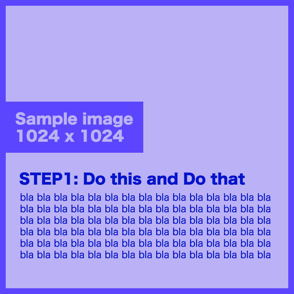
HINT: VERY effective alternative solution = make the text boxes somewhere outside Gempages (such as photoshop or even Excel). And save them as images, then line up. This is the easiest way to make the neat layout and in fact not few webpage has such layout. However, the text is not editable in Gempages and you need to keep the external files separately for future changes. Mainly this way is for banners etc.
TITLE
TITLE
TITLE
TITLE
TITLE
TITLE
TITLE
TITLE
1-6-5 Control the over wrapping order
This is quite similar to 1-6-4 but will introduce just in case. To fully control the page layout, you need to be able to see how each elements over wrap. See the example. I want to show 4 groups of different images. They need to be shown in the correct order from STEP 1 to 4. it is natural to read from left to right and the order is correct in the wide screen. However, in the narrower screen, the order becomes 1-3-2-4. Can you fix it?
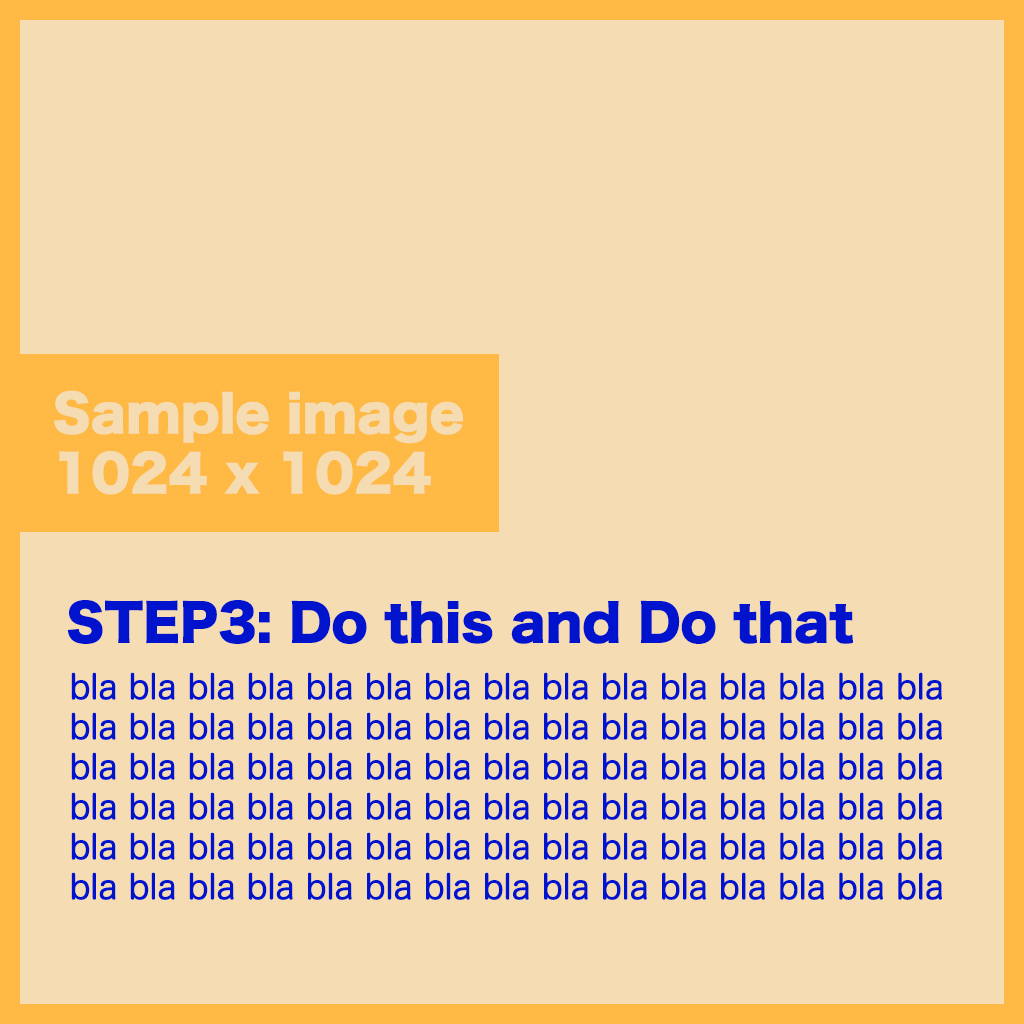
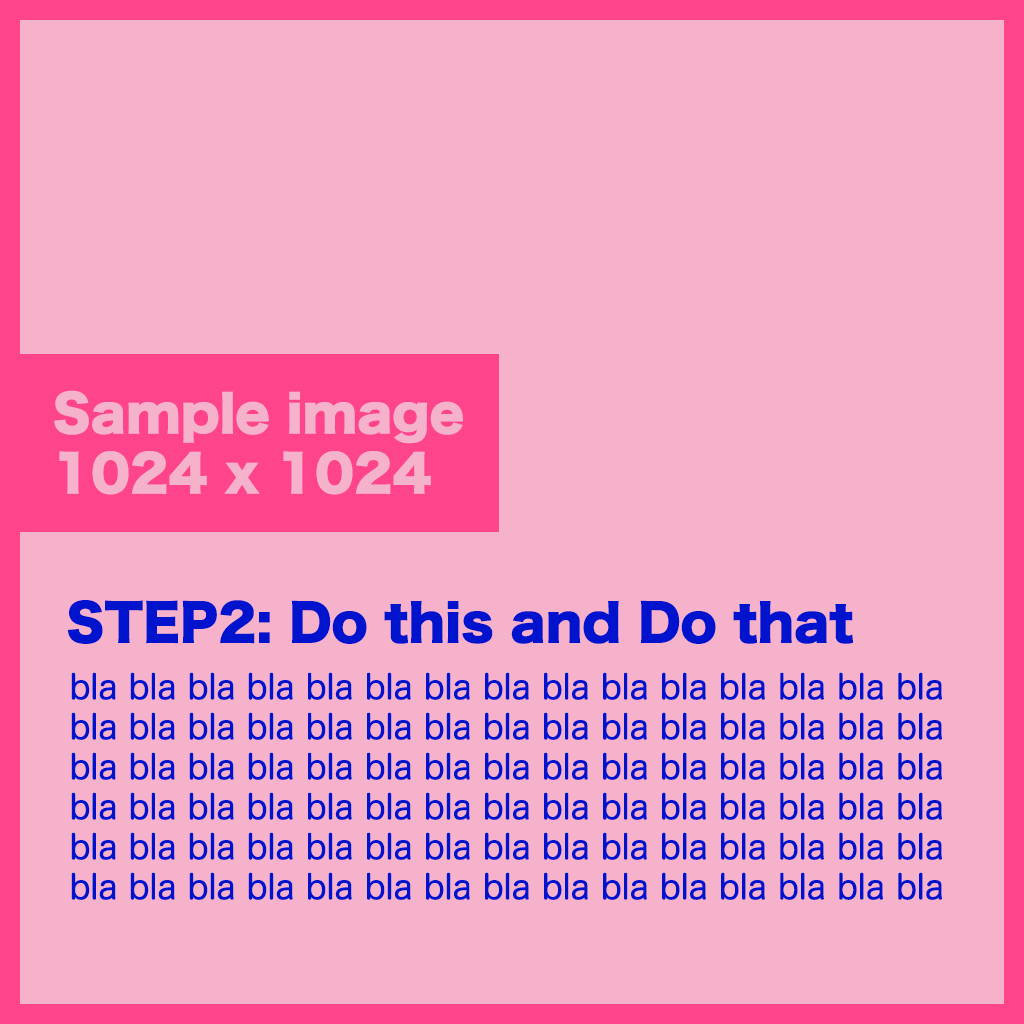
Here is the solution. Just split the group of images into STEP 1-2 and 3-4. Then 1 and 2 over wraps first and 3-4 comes below it.
POINT: Do not stuff too many element in one parent element (=Columns). Separate it as necessary so that it can stay under your control. But try not to split it into too small pieces. you will be unable to see which is which and can't see which parent element setting is affecting on which children elements.